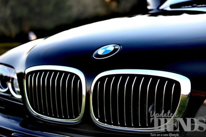
German based auto giant Bavarian Motor Works also known as BMW has introduced its redesigned logo which has marked the first in more than two decades. The new logo has given up on the black ring and has kept a transparent circle while the rest of it has got a modern look that looks modern. The blue and white emblem has been retained. The company will be using the new logo for communication purpose and will also be using it on the social media platforms.
Jans Thiemer, the senior vice president of brand and customer in a statement said that the new logo is meant to radiate more openness and clarity. Thiemer added that the new logo also symbolizes the company’s relevance and significance in terms of mobility and the pleasure of driving in future. A spokesperson from BMW also clarified that it does not have any plans to introduce the new logo on its vehicles but it has emblazoned it hood of its Concept i4 vehicle, which is an electric car that is aimed at Tesla and was launched on March 3, 2020.
The earlier logo by BMW was introduced in 1997 and in its history of 103 years, the company has had 6 logos and all of them have striking similarities. Since a long time the fans of the auto giant have been speculating that the inside of the logo had represented the propeller but the company gave a clarification that it is actually that the white and blue pattern had actually represented the state of Bavaria in Germany. The propeller speculation originated from the company’s description on the website that had originated from the old advertisements of BMW which had promoted its airplane engines.
Executive director for design form Siegel+Gale at Doug Sellers said that the new logo has been made as a part of the improvement that it feels more appropriate and accessible for the younger customers who are tech friendly.
Photo Credits: Pixabay


